One of the key parts of producing a mobile website is understanding the screens of the devices that visit your site, Too many websites are built for and tested on the iPhone and take no heed of any other screensize after all who doesn’t have an iPhone? Well lots of people don’t and lots of people have all sorts of different sized screens.
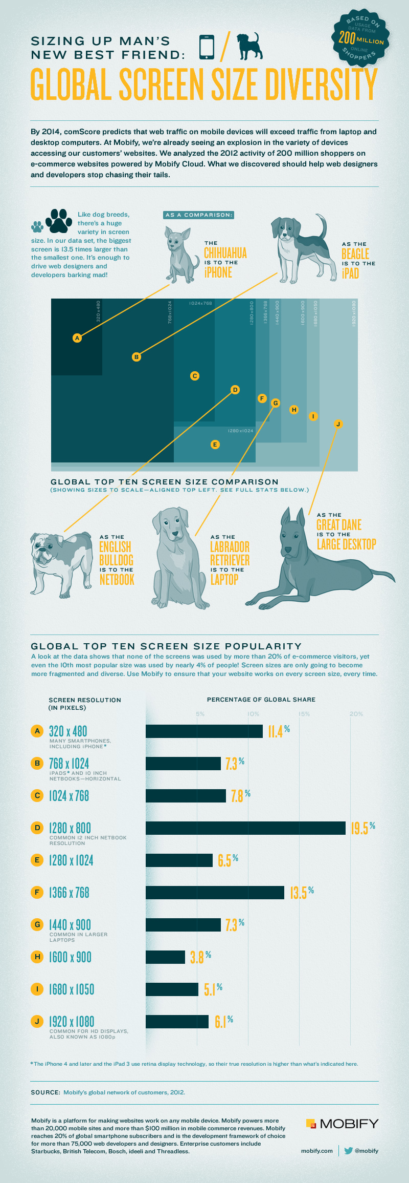
To prove that we don’t all use iPhones Mobify have delved into the data from over 200-million website visitors and looked at screen sizes. From the millions of visits they’ve created the Screen size diversity infographic below, which compares the screen sizes to man’s best friends, but god knows why because it doesn’t really help make things any clearer.
If you were to base your whole mobile strategy on this then you’d be making a big mistake. If you add up all the figures you get 88.3% leaving 11.7% for the rest of the mobile web which seems bugger all and not worth bothering with. BIG MISTAKE. I’ve got a house full of them and I use them all to get on the web on a daily basis and I’m sure I’m not alone in this, every morning I’m surrounded by people on trains and tubes with small devices. Look at it this way, nearly all the devices on this chart are NOT mobiles, they’re tablets, and tablets are used in different places and at different times to mobiles.
If you class the top end of mobile screens to be somewhere around the 480×800 ie the Galaxy Note S II or even the Galaxy S III 1280×720 you’ll see that it doesn’t even get in the top ten – somewhat bizarre considering the Galaxy S III was the best selling smartphone last year. If you then redo the math you’ll see that the missing devices which make up the 11.7% not mentioned on this top ten actually becomes slightly over 50% while the 11.4% for the iPhone should be slightly under 50%. Yes that’s right if you only cater for the iPhone you risk ignoring more that half of the mobile devices on the market.

